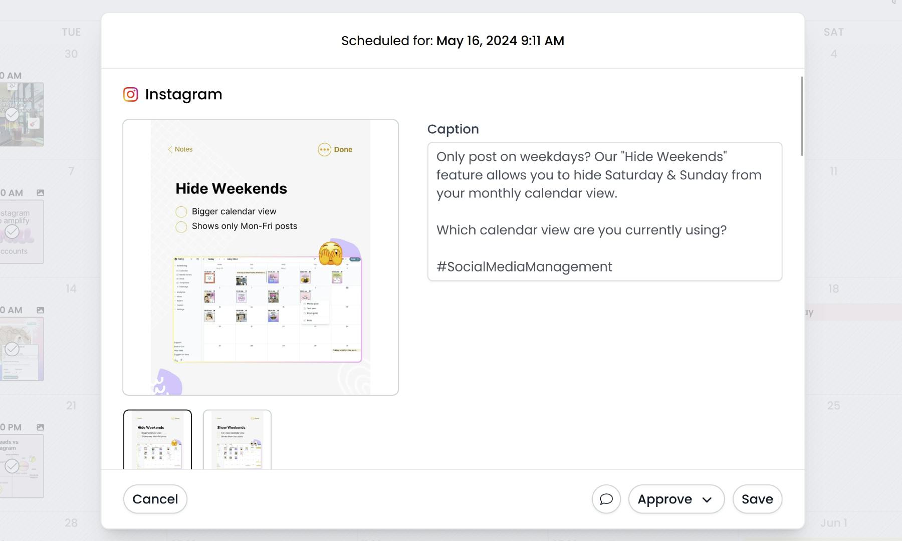
Pallyy's shared calendar has been re-built from the ground up.
Although it looks pretty similar (you may not even notice the difference), we've fixed a lot of bugs and made it much more reliable, making it even easier for your clients to use.
The shared calendar is now an (almost) exact replica of what you see in your Pallyy dashboard.
We've also added few new extra features in.
1. A simple welcome guide
When you land on the new calendar for the first time you'll see a welcome guide with a few images and descriptions of how it works. This should make it easier for your clients to get started.
2. Clients can add their name
Previously if your client approved a post or left a comment it would say "client via shared calendar", however now you must add a name when leaving comments which will show in your post activity making it easier to understand who did what.
3. Easier to use on mobile
We've made sure all views are usable on mobile, including the month view. You can even hide weekends to give yourself more space.
4. Always up-to-date
Previously the data could be old unless you refreshed the page. Now all data is up to date in real time which means no missed comments or updates.
What's next?
We're planning a few other features around this shared calendar, so if you have any suggestions please send them through to us ASAP. Everything will be considered.
And of course if you have feedback, we'd also love to hear it - send us an email!
Related articles:
